Usage
To start using the components in your project import the stylesheet into your css or html file.
The icons used in this component library are taken from Font Awesome Icons. You can use the icons with the help of font awesome cdn.
Alerts
Alerts provide feedback to the user depending on the situation that arises.
The alert components namely have four variants.They are success alert,danger alert,warning-alert,info alert.
Examples of alerts
Avatars
Avatars are images that users can set as their profile picture.
Some variants of avatars include rounded avatars,squared avatars and also avatars with text.
Examples of avatars
Rounded avatars
Squared avatars
Text avatars
Badges
Badges can be used set status or also get the count of number of messages or notifications you have received.
In the examples given below,all the badges are positioned relative to the icon.
Examples of Badges
Badge on icons
9+
Badge on avatars
Cards
A card is a flexible and extensible content container. It includes options for headers and footers, a wide variety of content and contextual background colors.
Examples of Components
Text only card with shadow
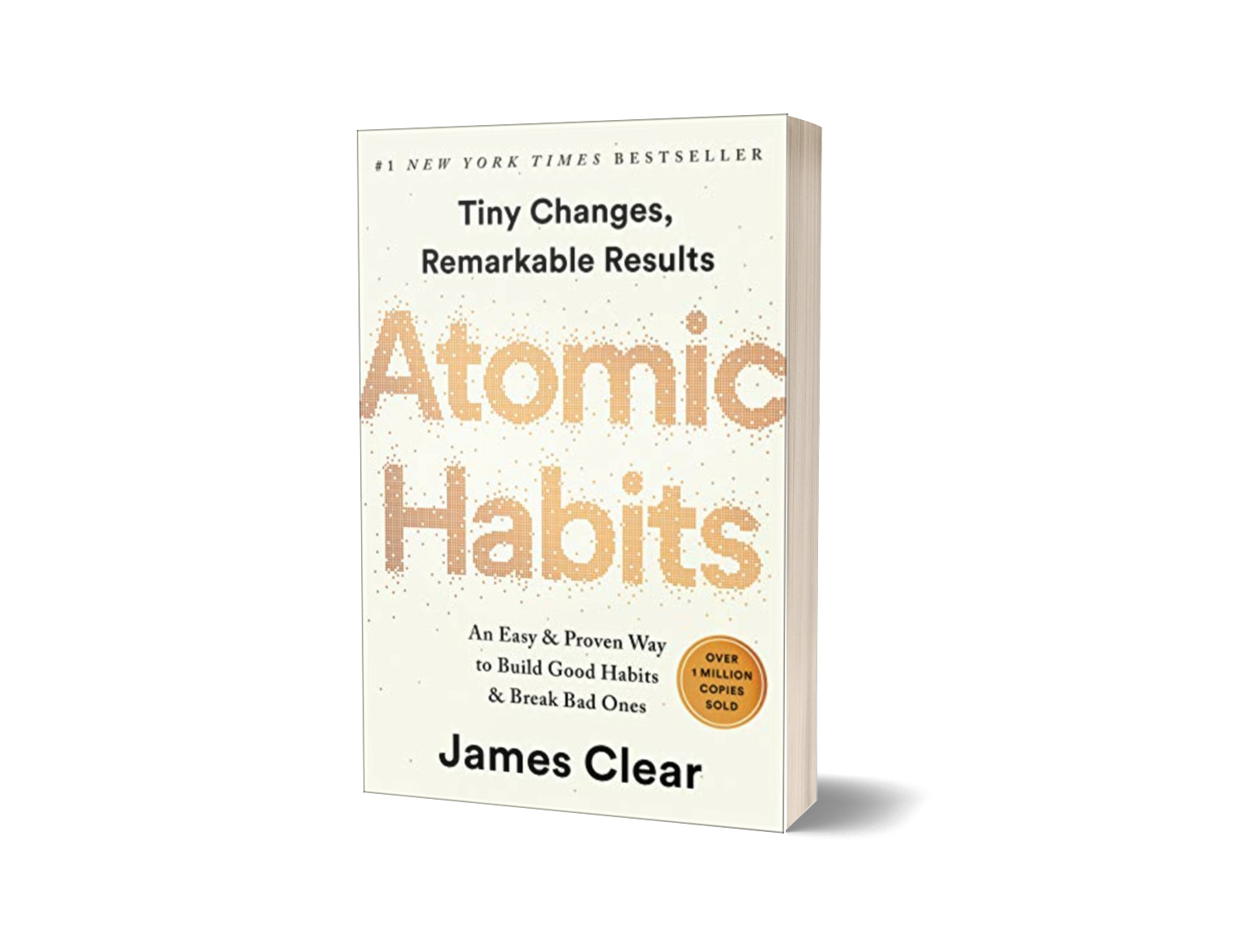
Atomic Habits
by James Clear
This breakthrough book from James Clear is the most comprehensive guide on how to change your habits and get 1% better every day.A supremely practical and useful book.
Vertical Card containing Text+Image
Atomic Habits
by James Clear
This breakthrough book from James Clear is the most comprehensive guide on how to change your habits and get 1% better every day.A supremely practical and useful book.
Card with badge
Atomic Habits
by James Clear
This breakthrough book from James Clear is the most comprehensive guide on how to change your habits and get 1% better every day.A supremely practical and useful book.
Card with text overlay
Atomic Habits
by James Clear
This breakthrough book from James Clear is the most comprehensive guide on how to change your habits and get 1% better every day.A supremely practical and useful book.
Horizontal Card
Here I have used the icons from font awesome.So make sure you include the font awesome cdn to use these icons
Atomic Habits
by James Clear
This breakthrough book from James Clear is the most comprehensive guide on how to change your habits and get 1% better every day.
Card with Dismiss
Atomic Habits
by James Clear
This breakthrough book from James Clear is the most comprehensive guide on how to change your habits and get 1% better every day.A supremely practical and useful book.
Card with header and buttons

WATCHES
Product listing card

U.S. Polo Assn.
₹ 2000 ₹3999(40% OFF)
3 | 5
Images
Examples of image components
Responsive image

Round image
Inputs
Examples of input components
Basic input textbox
Input validation
Typography
The Typography component makes it easy to apply a default set of font weights and sizes in your application.
Heading typography
Text styles and Text alignment
This is a text line through which draws a line through.
This is text underline which underlines a text
Bold weight
Normal weight
Light weight text
Italic text
This is centered text
Lists
Lists can be used to list out various things in several places
Ordered Lists
- Item one
- Item two
- Item three
- Item one
- Item two
- Item three
- Item one
- Item two
- Item three
- Item one
- Item two
- Item three
Unordered Lists
- Item one
- Item two
- Item three
- Item one
- Item two
- Item three
- Item one
- Item two
- Item three
- Item one
- Item two
- Item three
To create a inline style list just add the class inline-style to ul tag
- Item one
- Item two
- Item three
Modal
Modals are pop-ups that can be used to show certain information which could be important to the user.
To find out how a modal works go ahead and click on Show modal button below.To close the modal you can click on X or you can also click on the Escape key.
Toasts
Toasts are pop up messages which are used to convey a certain message to the user
You can replace the class .toast with theh class .toast-stacked to use a stacked toast.
Order has been placed !
✕
Try again!
✕
Can't share file "payments.pdf" !
✕
This item already has the label "travel".You can add a new label.
Add a new label
✕
Ratings
Ratings are a way of expressing one's displeasure or one's staisfaction towards a certain product or a service.
You can click on the stars below to give a rating.
Grid
A simplified 50-50 grid


A simplified 60-40 grid
A simplified grid with 3 items